The Art of Typography: Choosing the Right Fonts for Your Digital Projects
Table of Contents
- Introduction
- The importance of typography in digital design
- Understanding typefaces
- Legibility and readability
- Font pairing
- Accessibility considerations
- Branding considerations
- Tools for font selection
- Trends in typography
- Typography in digital design
Introduction
Typography is the art of arranging type, and it is an essential aspect of design, particularly for digital projects. The typeface you choose can greatly impact how your digital project is perceived and understood by your audience. Choosing the right fonts can help improve legibility, convey the tone and mood of your message, and create an overall aesthetic that enhances your design.
In this digital age, there are countless fonts available, which can make it difficult to know which ones to choose. The process of selecting the right font can be overwhelming, but it is essential to take the time to choose wisely. In this article, we will explore the art of typography and provide tips for selecting the right fonts for your digital projects.
The importance of typography in digital design
Why typography matters in digital design and how it can impact the user experience.
Typography is an essential component of digital design, as it directly impacts the user experience and the overall effectiveness of a project. The choice of fonts, font sizes, spacing, and other typographic elements can greatly influence how a user perceives and interacts with a digital interface. Here are some reasons why typography is so important in digital design:
-
Legibility: The primary function of typography is to make text readable, and legibility is critical for effective communication in digital design. Good typography can enhance the readability of the text and make it easier to scan and comprehend.
-
Navigation: Typography plays a crucial role in navigation by helping users find and interact with different parts of a digital interface. The right typography can guide users through the interface, highlight important information, and create a clear hierarchy of information.
-
Branding: Typography is a key component of branding, as it helps to establish a consistent and recognizable visual identity. A unique and distinctive font can set a brand apart from competitors and create a strong emotional connection with users.
-
Mood and tone: Typography can convey mood and tone, and set the overall emotional tone for a digital project. Different typefaces can evoke different emotions and convey different messages, which can be used to create a specific atmosphere and impact user engagement.
-
Accessibility: Good typography can improve accessibility by making it easier for people with visual impairments or dyslexia to read and understand digital content. Careful font selection, font sizes, and contrast can make a significant difference in accessibility and user experience.
In conclusion, typography is an essential element of digital design that can impact readability, navigation, branding, mood and tone, and accessibility. Choosing the right typography is critical to creating a successful digital project that effectively communicates with its audience.
Understanding typefaces
Different types of typefaces, including serif, sans-serif, script, and display fonts and how each typeface is best used and the mood or tone they convey.
Typography is the art of arranging type, and it is crucial to choose the right typeface to effectively communicate your message. There are several types of typefaces available, and each typeface has its unique characteristics, including their visual appearance, legibility, and mood or tone. Here’s an overview of the four primary typefaces and how they can be best used in digital design:
-
Serif: Serif typefaces have small strokes or flourishes at the end of their letters, which are called serifs. Serif fonts are considered to be traditional and formal and are best used for long blocks of text in print materials, such as books, magazines, and newspapers. They can also be used in digital designs for headings, subheadings, and body text, where a classic or authoritative feel is desired.
-
Sans-serif: Sans-serif typefaces don’t have the small strokes at the end of the letters, which gives them a clean, modern look. They are easy to read, particularly at small sizes, and are widely used in digital design. Sans-serif fonts are ideal for headlines, subheadings, and body text, as they are straightforward and communicate a modern, sleek look.
-
Script: Script typefaces mimic handwriting and have a fluid, cursive appearance. They are best used in digital design for logos, invitations, and other creative works where a more formal, elegant look is required. Script fonts can be challenging to read at smaller sizes, so they should be used sparingly, particularly in body text.
-
Display: Display typefaces are designed to make an impact and are ideal for use in headlines, banners, and advertisements. They are typically bold, decorative, and creative, making them an excellent choice for digital designs that aim to catch the user’s attention. However, they can be difficult to read in long blocks of text and should be used sparingly.
In conclusion, understanding the different types of typefaces and their best use cases is essential for selecting the right typeface for your digital design projects. Whether you’re creating a website, social media post, or email newsletter, selecting the right typeface can help to convey your message effectively and enhance the user experience.
Legibility and readability
Importance of choosing a font that is easy to read, particularly in digital environments where people may be reading on small screens or in low light.
Legibility and readability are two critical aspects of typography that play a significant role in the effectiveness of digital design. Legibility refers to how easy it is to distinguish one letter from another, while readability refers to how easy it is to read and comprehend the text as a whole. Here are some reasons why legibility and readability are crucial in digital design and how to choose a font that is easy to read:
-
User experience: Good legibility and readability are essential for an excellent user experience in digital design. When users can quickly read and comprehend the text, they can engage more effectively with the content, leading to better user satisfaction and retention.
-
Small screens: Digital interfaces are often viewed on small screens, such as smartphones or tablets. As a result, it is crucial to choose a font that is easy to read at small sizes. Sans-serif fonts tend to be more readable at smaller sizes than serif fonts, as they have simple, clean lines and are less affected by pixelation.
-
Low light: In low light conditions, such as reading on a smartphone or tablet at night, it can be challenging to read text that is not well-designed for legibility. Using fonts that are easy to read, such as sans-serif fonts with adequate contrast, can significantly improve legibility in these situations.
-
Typeface selection: When selecting a font, it is essential to consider its legibility and readability. Avoid fonts that are too condensed or have thin strokes that may make it difficult to distinguish between letters. Instead, choose fonts with clear letterforms, good spacing, and good contrast between letters and the background.
-
Font size: The font size also plays a significant role in legibility and readability. Choose a font size that is large enough to be read easily, particularly for longer blocks of text. Font sizes should be adjusted based on the reading distance, screen size, and type of content being displayed.
In conclusion, legibility and readability are critical considerations in digital design, particularly in a world where users view digital content on small screens and in different lighting conditions. Choosing a font that is easy to read can significantly impact the user experience and engagement with the content. It is essential to consider typeface selection, font size, and spacing to create legible and readable typography that effectively communicates the intended message.
Font pairing
How to choose complementary fonts that work well together and create a cohesive look for your digital project.
Choosing complementary fonts is an essential aspect of typography in digital design. The right font pairing can create a cohesive and balanced look that enhances the user experience and strengthens the overall message of the design. Here are some tips for choosing complementary fonts:
-
Choose contrasting styles: A successful font pairing will often involve choosing fonts with contrasting styles. For example, pairing a bold sans-serif font with a more delicate serif font can create an interesting and visually appealing contrast.
-
Consider hierarchy: The font pairing should reflect the hierarchy of the content. Headlines, subheadings, and body text should be differentiated with different fonts and styles to make the information easier to navigate.
-
Limit the number of fonts: Too many fonts can make a design appear cluttered and confusing. To maintain a cohesive look, limit the number of fonts used to no more than three.
-
Use a font pairing tool: There are several online tools available that can help with choosing complementary fonts. These tools can suggest font combinations based on a variety of factors such as font style, mood, and the intended use of the design.
-
Experiment with font sizes: Experiment with different font sizes to see how the pairing looks at different sizes. This will help you choose the right sizes for the different elements in your design.
-
Look for inspiration: Inspiration can be found in many places, including other designs, typography blogs, and social media. Look for designs with successful font pairings and use them as inspiration for your own work.
Use Pinterest to find inspiration for font pairings.
In conclusion, choosing complementary fonts is an essential aspect of typography in digital design. Consider contrasting styles, the hierarchy of the content, limit the number of fonts, use font pairing tools, experiment with font sizes, and look for inspiration to create a cohesive and visually appealing design that effectively communicates your message. With careful consideration and attention to detail, you can choose the perfect font pairing for your digital project.
Accessibility considerations
How certain fonts may be more accessible to people with visual impairments or dyslexia, and provide tips for choosing fonts that are inclusive.
Accessibility is an essential consideration in digital design, and it is crucial to choose fonts that are inclusive and accessible to people with visual impairments or dyslexia. Here are some tips for choosing fonts that are accessible:
-
Sans-serif fonts: Sans-serif fonts are generally more accessible than serif fonts as they are easier to read at smaller sizes and have clean, simple letterforms. They are particularly useful for digital interfaces that may be viewed on small screens.
-
Use adequate spacing: Adequate spacing between letters and lines can improve readability for people with visual impairments. Fonts with tight spacing or condensed letterforms can make it difficult for people with visual impairments to read.
-
Avoid using all-caps: Avoid using all-capital letters, as they can make it difficult for people with dyslexia to distinguish between words and letters.
-
Consider dyslexia-friendly fonts: There are several dyslexia-friendly fonts available that are specifically designed to improve readability for people with dyslexia. These fonts often have unique letterforms, increased spacing, and better differentiation between letters.
-
Choose a font with good contrast: Good contrast between the text and the background can improve readability for people with visual impairments. Choose a font with a high contrast ratio, particularly for longer blocks of text.
-
Test readability: Test the readability of the chosen font by simulating the experience of people with visual impairments or dyslexia. This can be done using online tools that simulate different visual impairments.
In conclusion, accessibility considerations are an essential aspect of digital design, and it is crucial to choose fonts that are inclusive and accessible to people with visual impairments or dyslexia. Choosing sans-serif fonts, using adequate spacing, avoiding all-caps, considering dyslexia-friendly fonts, choosing fonts with good contrast, and testing readability can all improve accessibility in digital design. By making accessibility a priority, designers can create more inclusive and user-friendly designs.
Branding considerations
How the font you choose can impact your brand and how to choose a font that aligns with your brand values and message.
The font you choose can have a significant impact on your brand identity and how your brand is perceived by your audience. Fonts can convey different emotions and messages, and choosing the right font can help you establish a consistent and recognizable brand identity. Here are some branding considerations when choosing a font:
-
Reflect your brand values: The font you choose should reflect your brand values and the message you want to communicate. For example, a modern and bold font can communicate innovation, while a classic and elegant font can communicate sophistication.
-
Consistency: Consistency in typography is essential for brand recognition. Choosing a font that is consistent with your brand style guide and using it consistently across all branding materials, including digital and print, can help to reinforce your brand identity.
-
Legibility: Legibility is still important in branding. Choosing a font that is easy to read and can be read at different sizes can help to ensure that your brand message is effectively communicated to your audience.
-
Differentiate yourself: Consider how the font you choose will differentiate your brand from your competitors. Choosing a unique and distinctive font can help your brand stand out and create a strong emotional connection with your audience.
-
Flexibility: Consider the versatility of the font you choose. A font that works well for digital materials may not work well for print materials or different mediums. Consider whether the font can be adapted to work across different platforms.
In conclusion, branding considerations are crucial when choosing a font for your brand. The font you choose should reflect your brand values, be consistent with your brand style guide, be legible, differentiate yourself from your competitors, and be versatile enough to work across different mediums. By carefully considering these branding factors, you can choose a font that effectively communicates your brand message and strengthens your brand identity.
Tools for font selection
Resources and tools that can help designers choose the right fonts for their digital projects, such as online font libraries, typeface pairing tools, and font size calculators.
Choosing the right fonts for a digital project can be a challenging task, but there are several resources and tools available that can help designers make informed decisions. Here are some of the most useful tools for font selection:
-
Online font libraries: There are several online font libraries available that offer a vast selection of fonts for digital design projects. These libraries allow designers to browse and search for fonts based on different criteria, such as font style, mood, and popularity. Some popular online font libraries include Google Fonts, Adobe Fonts, and Font Squirrel.
-
Typeface pairing tools: Typeface pairing tools are designed to help designers choose complementary fonts that work well together. These tools suggest font combinations based on different factors such as font style, mood, and intended use. Some popular typeface pairing tools include Type Genius and Font Pair.
-
Font size calculators: Font size calculators can be useful for determining the ideal font size for a specific digital project. These calculators take into account different factors such as the screen size, viewing distance, and type of content being displayed. Some popular font size calculators include Type Scale and Modular Scale.
-
Accessibility checkers: Accessibility checkers can be used to evaluate the accessibility of a font and identify potential issues that may affect readability for people with visual impairments or dyslexia. These tools simulate different visual impairments and evaluate the font’s legibility and contrast. Some popular accessibility checkers include WebAIM and Color Contrast Checker.
-
Design inspiration websites: Design inspiration websites can be a useful resource for font selection. These websites showcase examples of successful digital design projects and provide inspiration for font selection and pairing. Some popular design inspiration websites include Behance and Dribbble.
Use DaFont & Google Fonts to find fonts for your project.
In conclusion, there are several resources and tools available to help designers choose the right fonts for their digital projects. Online font libraries, typeface pairing tools, font size calculators, accessibility checkers, and design inspiration websites are all valuable resources that can assist designers in making informed decisions about typography in digital design.
Trends in typography
Current trends in typography and how they can be incorporated into digital design projects, while also cautioning against blindly following trends without considering the needs of the project and the audience.
Typography, like any other design element, is influenced by current trends and styles. Incorporating these trends into digital design projects can help to create modern and visually appealing designs. However, it is essential to balance the latest trends with the needs of the project and the audience. Here are some current trends in typography and how to incorporate them into digital design projects while being mindful of the project’s needs and the audience:
Bold and expressive typefaces
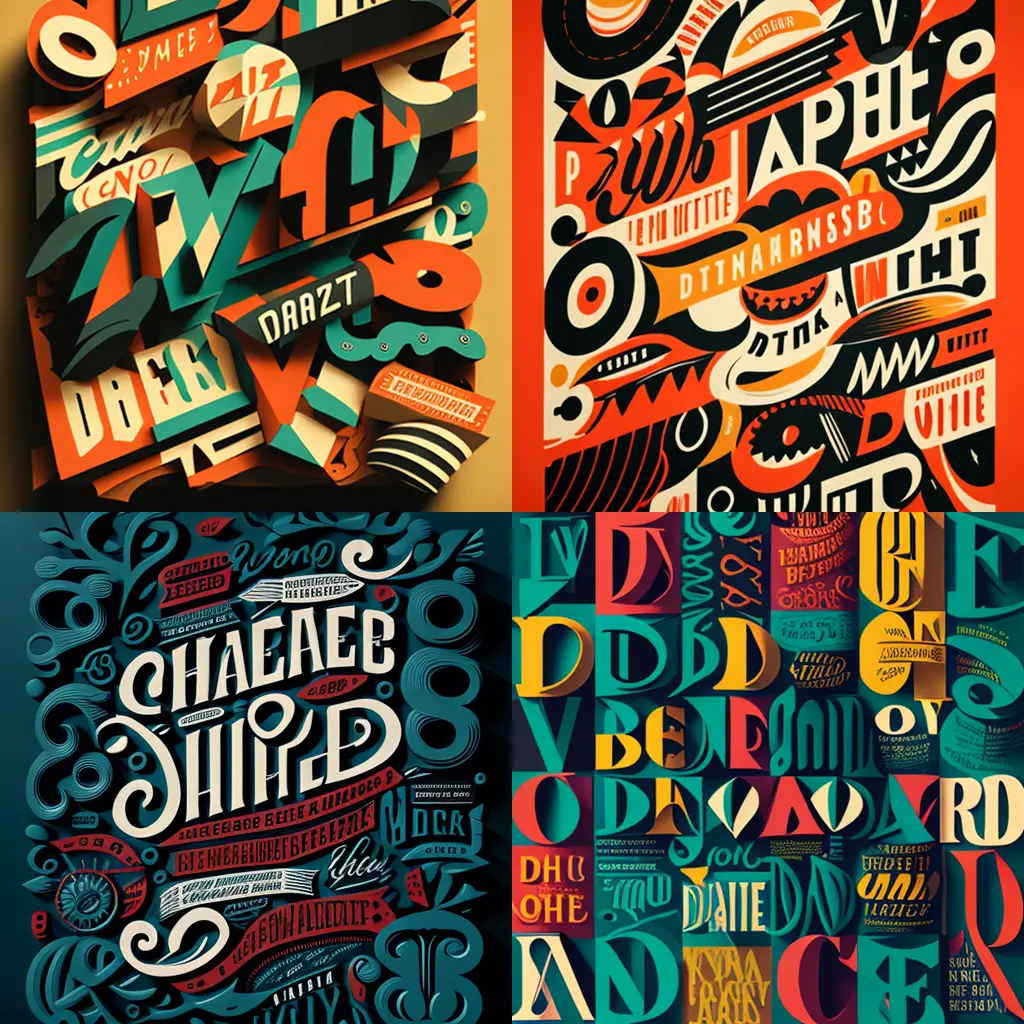
Bold and expressive typefaces are currently popular in digital design. These fonts can add personality and energy to digital designs and help to create a bold and impactful message. When using bold and expressive typefaces, it’s essential to balance them with clear and legible fonts to ensure readability.

Geometric typefaces
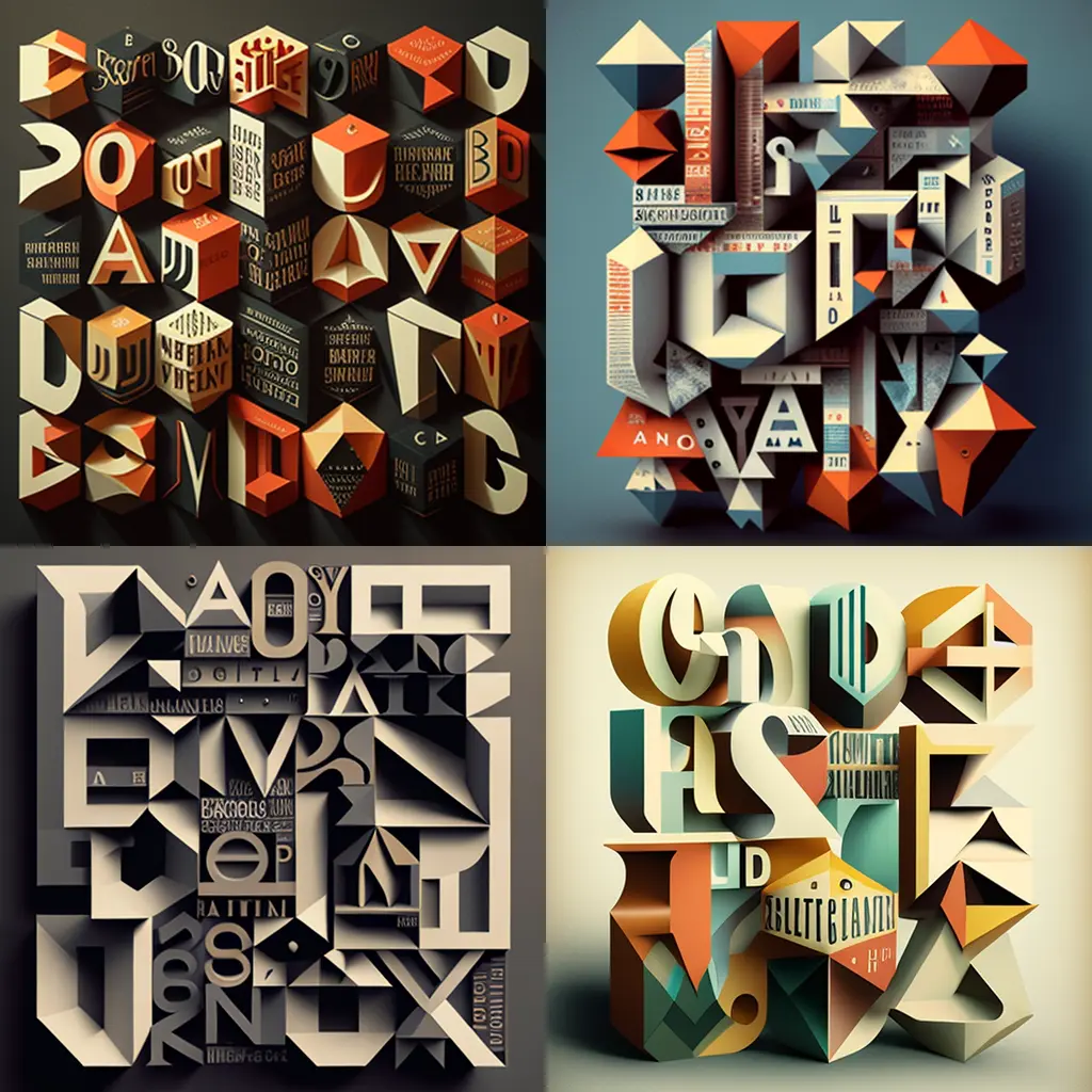
Geometric typefaces have become increasingly popular in recent years due to their modern, sleek, and clean appearance. These fonts work well in digital design, particularly for websites and interfaces that require a minimalist design aesthetic.

Handwritten and script fonts
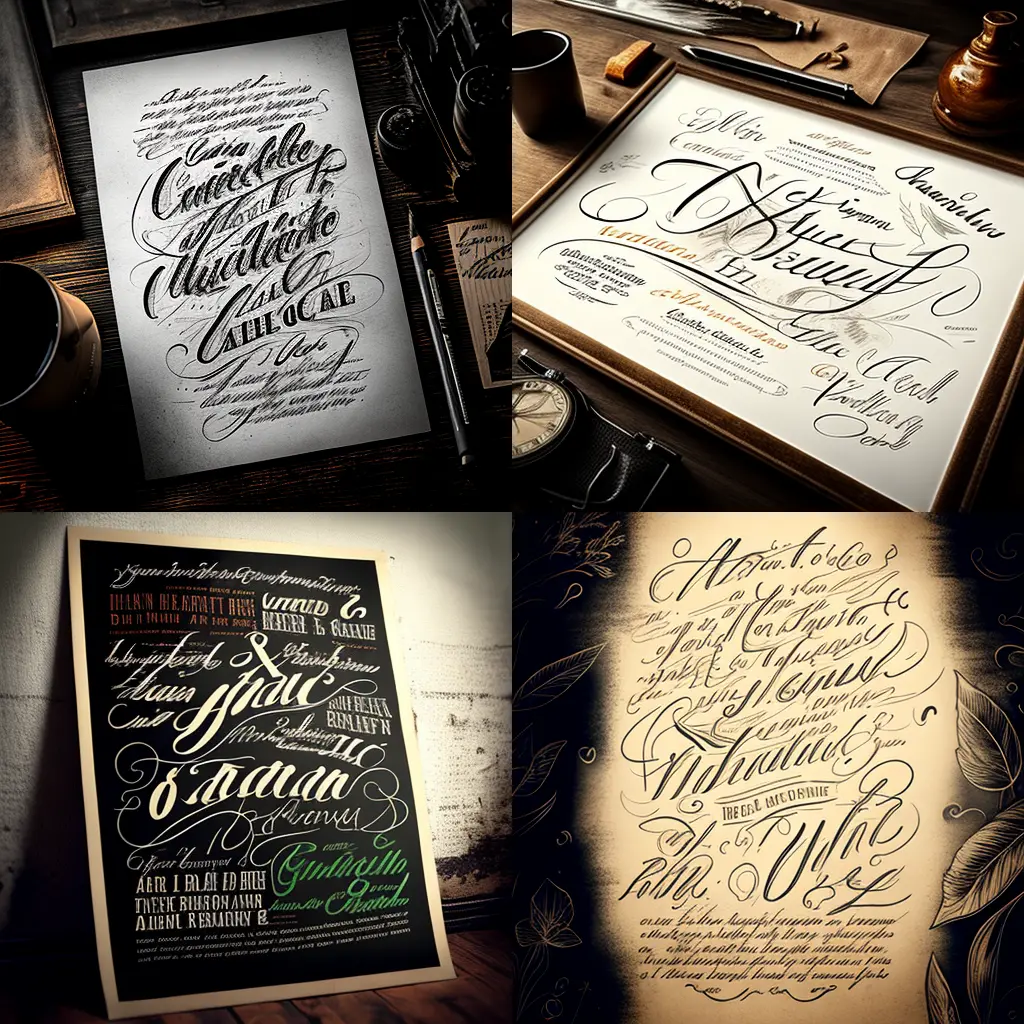
Handwritten and script fonts are currently popular in digital design and are used to add a personal and authentic touch to designs. When using handwritten or script fonts, it’s essential to balance them with clear and legible fonts to ensure readability.

Minimalist typography
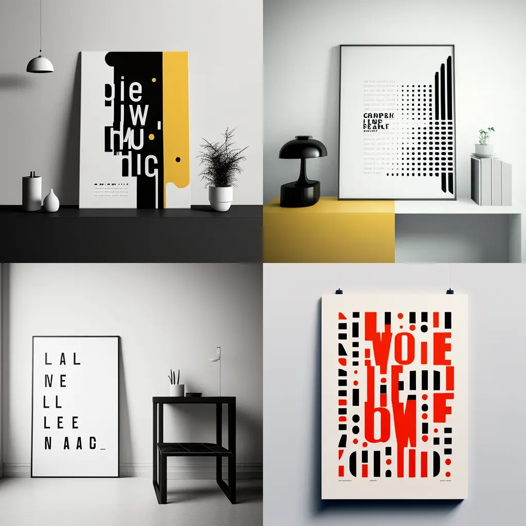
Minimalist typography is a trend that has been popular in digital design for several years. This trend emphasizes simplicity and clarity, with a focus on clean lines and negative space. Minimalist typography can be an excellent choice for digital designs that require a clean and modern look.

While it’s essential to stay informed about the latest typography trends, it’s equally important to consider the needs of the project and the audience. Blindly following trends without considering these factors can result in designs that are not effective in communicating the intended message or engaging with the audience. Instead, designers should carefully consider the project’s needs, the intended audience, and the brand identity before incorporating any typography trends.
In conclusion, staying informed about current typography trends can help designers create modern and visually appealing designs. However, it’s important to balance these trends with the needs of the project and the audience. By considering these factors, designers can create effective and engaging designs that communicate the intended message and connect with the audience.
Typography in digital design
How typography is used in digital design, including websites, apps, and interfaces, and how it can be used to create a positive user experience.
Typography plays a crucial role in digital design, particularly for websites, apps, and interfaces. Good typography can improve the user experience, increase engagement, and effectively communicate the intended message. Here are some ways typography is used in digital design:
-
Branding: Typography is a crucial component of brand identity in digital design. Choosing the right fonts can help to establish a consistent and recognizable brand identity, and reinforce the brand’s values and personality.
-
Hierarchy: Typography is used to create a hierarchy of information, making it easier for users to navigate and understand the content. This hierarchy is created by using different font sizes, styles, and weights for headlines, subheadings, and body text.
-
Readability: Good typography is essential for readability, particularly in digital environments where users may be reading on small screens or in low light. Choosing a font that is easy to read and can be read at different sizes can significantly improve legibility and readability.
-
Emphasis: Typography can be used to emphasize important information, such as calls to action, and highlight key messages. Using bold or italic fonts, different colors, and different font sizes can help to draw the user’s attention to the most critical information.
-
Mood and tone: Typography can be used to create a specific mood or tone in digital designs. For example, a modern and bold font can communicate innovation, while a classic and elegant font can communicate sophistication, and a handwritten font can communicate authenticity.
-
Accessibility: Typography can be used to improve accessibility in digital designs. Choosing fonts that are easy to read, with adequate spacing and good contrast, can improve legibility and readability for people with visual impairments or dyslexia.
In conclusion, typography plays a significant role in digital design, particularly for websites, apps, and interfaces. Good typography can improve the user experience, increase engagement, and effectively communicate the intended message. By carefully considering typography in digital designs, designers can create effective and engaging designs that communicate the intended message, connect with the audience, and improve the user experience.