All Website Layout Styles
Table of Contents
- Single Column Layout
- Full Screen Layout
- Split Screen Layout
- F-Shaped Layout
- Z-Shaped Layout
- Fixed Nav & Sidebar Layout
- Asymmetrical Layout
Single Column Layout
Introduction to Single Column Layout:
The single column layout is a clean and straightforward website design style that emphasizes simplicity and seamless content flow. In this layout, all the content of a webpage is arranged in a single vertical column, creating a focused and easy-to-read experience for the user. With its minimalistic approach, the single column layout offers a clutter-free interface and enhances the overall user engagement.
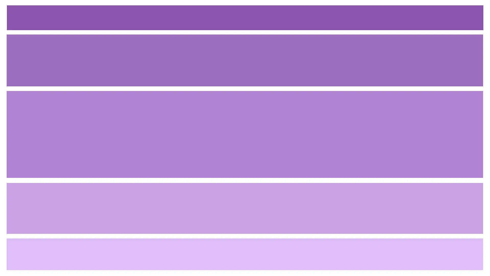
Examples of where to apply Single Column Layout:
-
Personal Blogs: Single column layouts work exceptionally well for personal blogs where the main focus is on delivering written content. By eliminating distractions and providing a clear reading experience, this layout allows readers to engage with the blog’s content without any visual clutter.
-
Portfolios: For showcasing a creative portfolio or a collection of work, a single column layout can effectively highlight each piece of artwork or project. It provides a clean canvas for presenting images, descriptions, and other relevant information in a straightforward manner, enabling visitors to focus on the showcased work.
-
Landing Pages: Single column layouts are often employed in landing pages for products or services. By presenting key information and a compelling call-to-action in a linear format, this layout guides visitors’ attention towards the desired action, increasing conversion rates.
-
Mobile-Friendly Websites: As mobile devices continue to dominate web traffic, single column layouts have become popular for responsive designs. With limited screen space on mobile devices, the single column layout ensures optimal readability and usability, making it an ideal choice for mobile-friendly websites.
-
Single-Page Websites: In the case of single-page websites, where all the content is condensed onto a single page, a single column layout simplifies navigation and allows for seamless scrolling. This layout style enables visitors to digest information effortlessly without having to navigate through multiple pages.
Examples of Single Column Layout
In summary, the single column layout offers a clean and focused design approach suitable for personal blogs, portfolios, landing pages, mobile-friendly websites, and single-page websites. Its simplicity and readability make it an effective choice for presenting content in a straightforward and engaging manner.
Full Screen Layout
Introduction to Full Screen Layout:
The Full Screen Layout is a captivating and immersive website design style that utilizes the entire screen space to create a visually stunning and engaging user experience. In this layout, the content expands to fill the entire viewport, eliminating any distractions and providing a seamless and uninterrupted browsing experience.
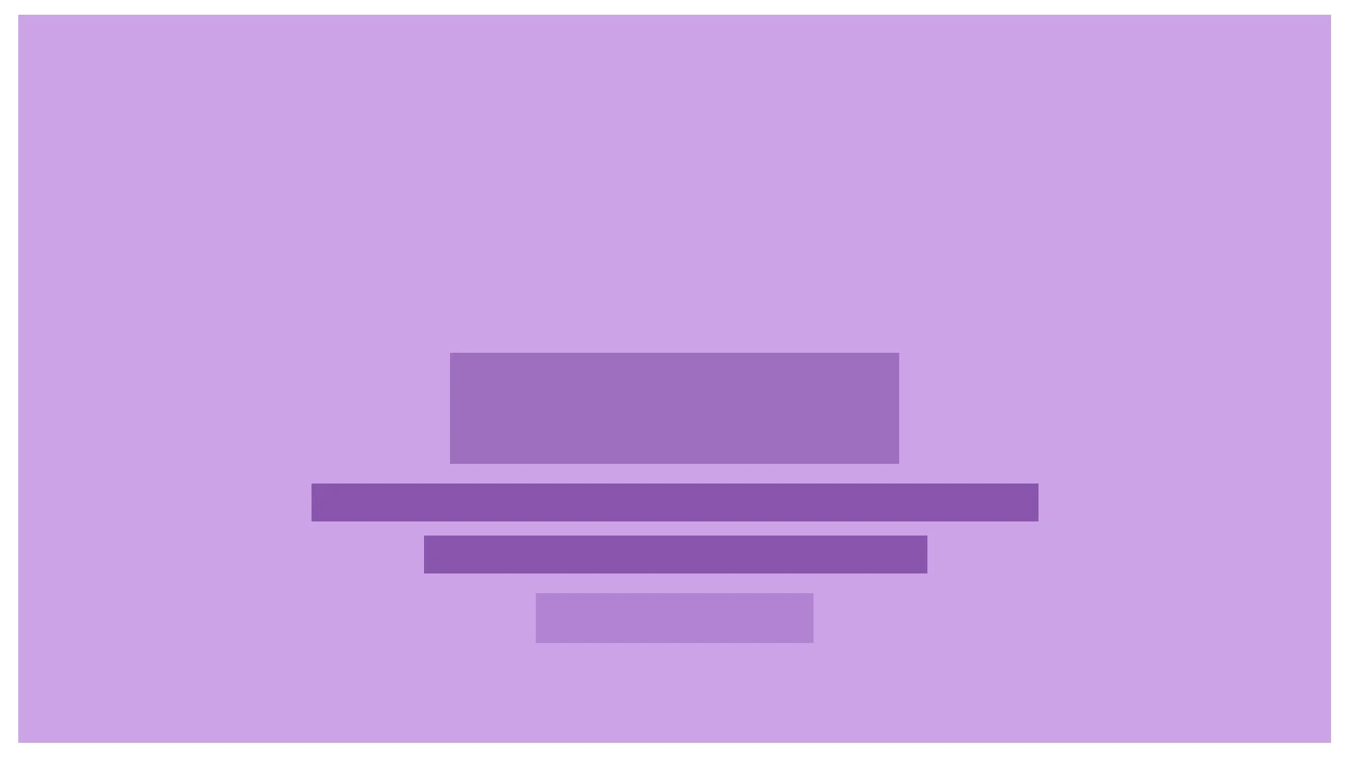
Examples of Where to Apply Full Screen Layout:
-
Photography Portfolios: Full Screen Layouts are often used in photography portfolios to showcase high-resolution images. By utilizing the entire screen, photographers can present their work in a visually striking and immersive manner, allowing viewers to fully appreciate the details and composition of each photograph.
-
Creative Agencies and Studios: Full Screen Layouts can be applied by creative agencies and studios to showcase their portfolio of projects, designs, and artwork. This layout style provides a canvas for displaying their creative work in a visually impactful manner, capturing the attention of potential clients and highlighting their expertise.
-
Landing Pages: Full Screen Layouts are effective for landing pages as they instantly grab the visitor’s attention and focus it on the main message or call-to-action. By utilizing the full screen, companies can create visually stunning and persuasive landing pages that leave a lasting impression and increase conversion rates.
-
Multimedia Websites: Websites that heavily rely on multimedia content, such as videos, animations, or interactive elements, can benefit from Full Screen Layouts. This layout style maximizes the impact of the multimedia elements, offering a rich and immersive experience to the users.
-
Event Websites: Full Screen Layouts are commonly used for event websites to create anticipation and excitement. By utilizing the entire screen, event organizers can showcase event details, schedule, speakers, and other relevant information in a visually captivating way, enticing potential attendees to participate.
Examples of Full Screen Layout
In summary, Full Screen Layouts are ideal for websites that aim to create a visually immersive experience, such as photography portfolios, creative agency portfolios, landing pages, multimedia-rich websites, and event websites. This layout style allows content to occupy the entire screen, resulting in a captivating and engaging user experience.
Split Screen Layout
Introduction to Split Screen Layout:
The split screen layout is a dynamic and visually engaging website design approach that divides the screen into two or more distinct sections. It creates a sense of balance, contrast, and organization by presenting different content or functionalities side by side. The split screen layout offers an intuitive way to display multiple elements simultaneously, making it ideal for websites that aim to provide users with diverse options or showcase contrasting information. By leveraging the split screen layout, web designers can create visually appealing and interactive user experiences that capture visitors’ attention and enhance usability.
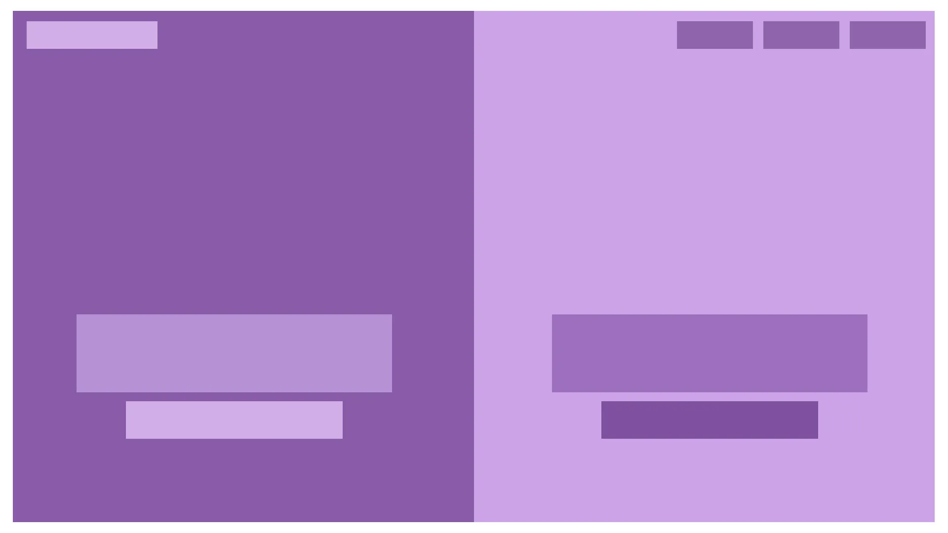
Examples of Where to Apply Split Screen Layout:
-
Portfolio Websites: Split screen layouts work exceptionally well for portfolio websites, allowing designers, photographers, or artists to showcase their work and present different projects side by side. One side of the screen can display a selection of thumbnail images, while the other side provides a larger preview or additional information about each project. This layout allows visitors to explore various works at a glance and choose the ones they are interested in for more details.
-
E-commerce Websites: Split screen layouts can be utilized in e-commerce websites to present products and their associated information effectively. For instance, one side of the screen can display product images or videos, while the other side showcases product details, pricing, and a call-to-action button for making a purchase. This layout enables users to compare different products or variations without navigating away from the main page, improving the shopping experience.
-
Landing Pages: Split screen layouts are often used in landing pages to present two distinct options or messages. For example, a software company may use a split screen layout to highlight two different product features or solutions side by side. This design choice enables visitors to quickly grasp the key offerings and make an informed decision based on their specific needs or preferences.
-
Comparison Websites: Split screen layouts are highly suitable for websites that focus on comparing products, services, or options. By dividing the screen into two or more sections, these websites can present a side-by-side comparison of features, prices, or other relevant information. Users can easily evaluate different options and make informed decisions based on the presented data, simplifying their research process.
-
News/Magazine Websites: Split screen layouts can be effectively used in news or magazine websites to highlight multiple stories or articles simultaneously. The layout can feature eye-catching images or headlines on one side, while the other side displays excerpts or key details of the stories. This design choice allows visitors to have a quick overview of various news items and choose which ones to explore further.
Examples of Split Screen Layout
Remember, the split screen layout can be customized and adapted to fit various types of websites and content, depending on the specific goals and requirements of the project.
F-Shaped Layout
Introduction to F-Shaped Layout:
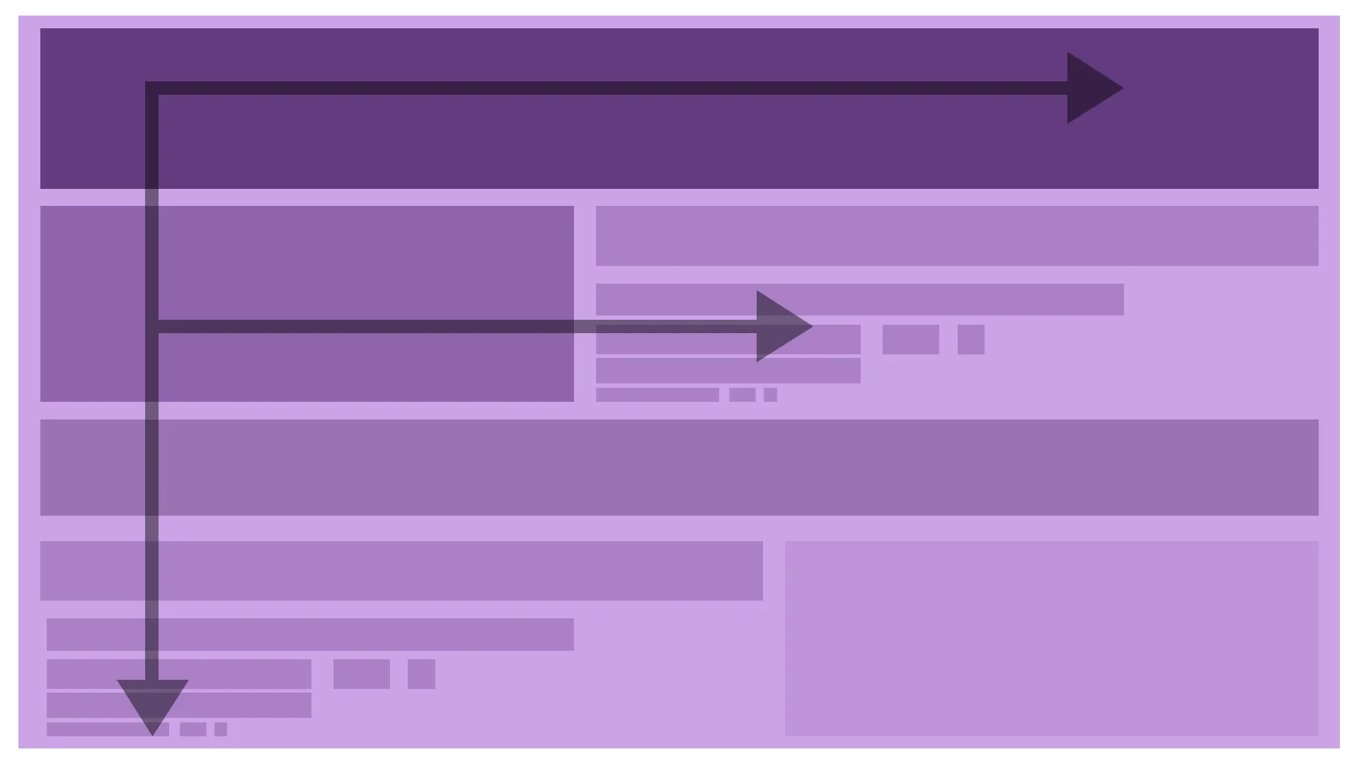
The F-Shaped Layout is a popular website design approach that strategically utilizes the natural reading pattern of users to enhance content engagement.
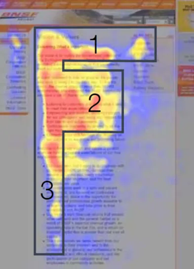
Inspired by eye-tracking studies, this layout arranges information in a way that accommodates users’ tendency to scan web pages in an “F” pattern. By placing key content elements along this pattern, the F-Shaped Layout aims to capture users’ attention and improve the overall user experience.
Examples of where to apply the F-Shaped Layout:
-
News Websites: News websites often employ the F-Shaped Layout to highlight important headlines, key information, and featured articles. By placing attention-grabbing headlines at the top and organizing supporting content along the F pattern, these sites can quickly capture users’ interest and encourage further exploration.
-
Blog Posts: The F-Shaped Layout can be particularly effective for blog posts or articles that aim to deliver information in a concise and scannable format. By placing the main points or key takeaways at the beginning and subheadings along the F pattern, readers can easily skim the content and locate the information they find most relevant.
-
Landing Pages: Landing pages, designed to convert visitors into customers or subscribers, often benefit from the F-Shaped Layout. By placing compelling headlines, calls to action, and key selling points along the top and left side of the page, the layout leverages users’ reading behavior to guide them towards desired actions or information.
-
E-commerce Product Pages: E-commerce websites frequently employ the F-Shaped Layout to showcase product details, images, and pricing. Placing the product title, main image, and key features along the top and left side of the page allows users to quickly assess the product’s value and make informed purchasing decisions.
-
Email Newsletters: When designing email newsletters, utilizing the F-Shaped Layout can help increase engagement and readability. Placing the most important information, such as the main headline or offer, at the top and arranging supporting content along the F pattern ensures that subscribers quickly grasp the main message and encourages them to continue reading.
Examples of F-Shaped Layout
By applying the F-Shaped Layout in these contexts, web designers can optimize the visual hierarchy of their content, improve usability, and enhance the overall user experience by aligning with users’ natural reading behaviors.
Z-Shaped Layout
Introduction to Z-Shaped Layout:
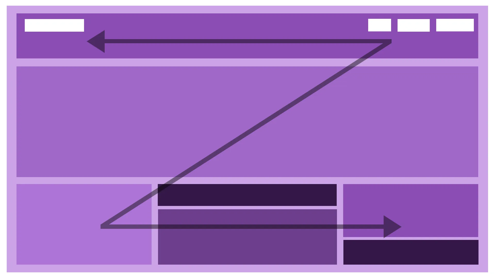
The Z-shaped layout is a popular design approach used in web design to guide users’ attention and optimize content consumption. Inspired by the natural eye movement patterns of Western cultures, the Z-shaped layout arranges content in a way that mimics the shape of the letter “Z.” This layout strategically places key elements along this path, ensuring that important information is presented in a visually appealing and easily scannable manner.
Examples of Where to Apply Z-Shaped Layout:
-
Landing Pages: When designing a landing page, the Z-shaped layout can be highly effective in capturing users’ attention and leading them towards a call-to-action (CTA). By placing the headline or logo at the top-left corner, important content in the middle, and a CTA at the bottom-right, the Z-shaped layout naturally guides users to follow the intended flow, increasing the likelihood of conversions.
-
Presentations and Slideshows: Z-shaped layouts can be applied to presentation slides to ensure a clear and logical progression of information. The top-left corner can feature a compelling title or key message, followed by supporting points or visuals across the middle, and concluding with a memorable closing statement or call-to-action at the bottom-right corner.
-
Blog Posts and Articles: Implementing the Z-shaped layout in blog posts and articles helps to optimize readability and engagement. Placing the main title or headline at the top-left corner, followed by a captivating introductory paragraph, key subheadings, and supporting content along the diagonal path, allows readers to quickly scan and digest the information in a logical sequence.
-
E-commerce Product Pages: Z-shaped layouts can enhance the user experience on e-commerce product pages by strategically presenting essential product information. Starting with an attention-grabbing product image or title at the top-left corner, followed by pricing, features, and customer reviews along the diagonal path, the Z-shaped layout enables users to make informed purchasing decisions with ease.
-
Portfolio Websites: For creative professionals showcasing their work on portfolio websites, the Z-shaped layout can effectively highlight key projects and achievements. Placing the most impressive or recent works at the top-left corner, followed by supporting details and descriptions along the diagonal path, allows visitors to navigate through the portfolio in a visually appealing and intuitive manner.
Examples of Z-Shaped Layout
By utilizing the Z-shaped layout in these examples, designers can leverage the natural eye movement patterns of users to create visually engaging and effective web experiences.
Fixed Nav & Sidebar Layout
Introduction to Fixed Nav & Sidebar Layout:
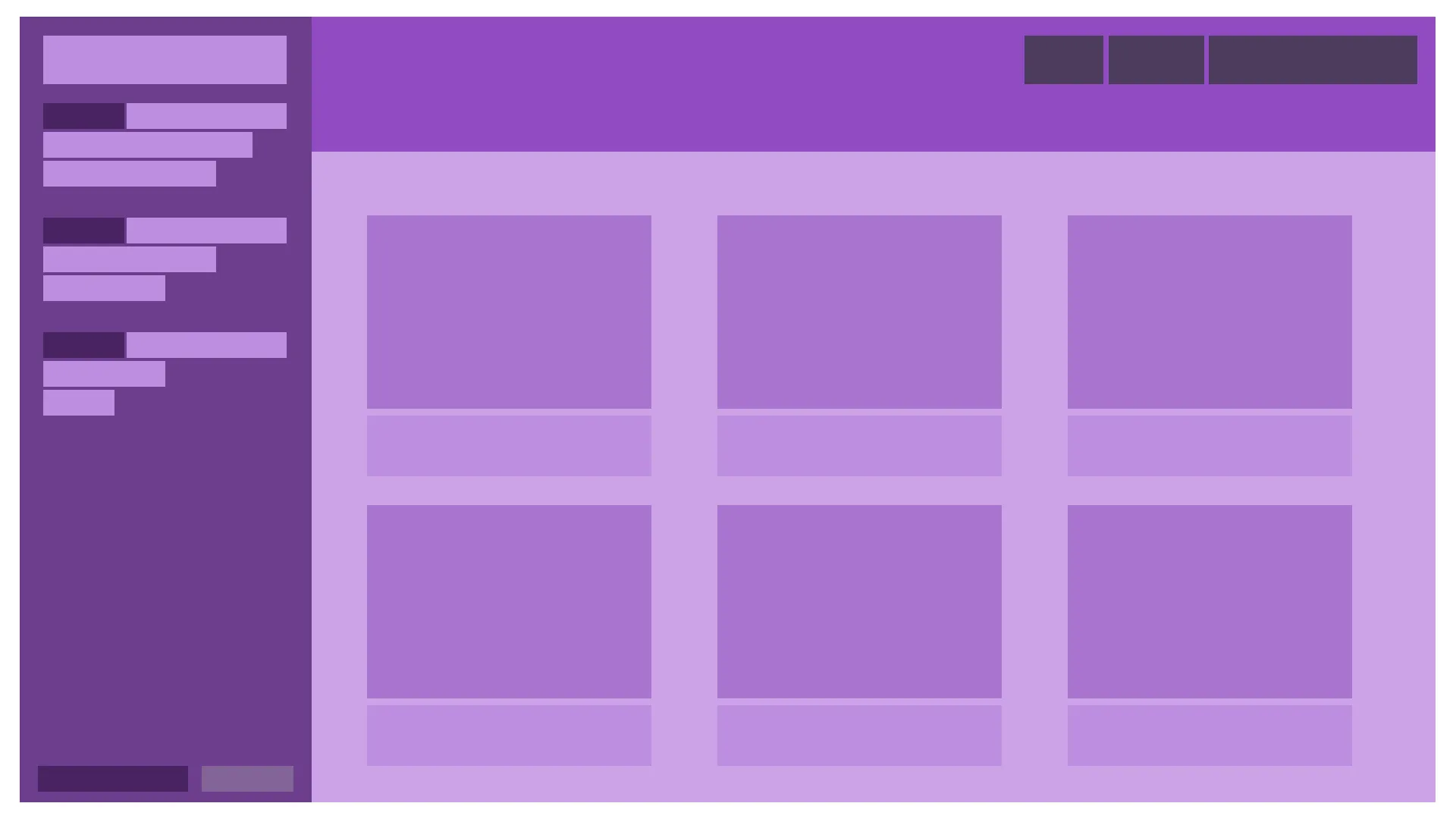
The Fixed Nav & Sidebar Layout is a popular website design style that features a fixed navigation menu and sidebar, creating a consistent and accessible user experience. In this layout, the navigation menu and sidebar remain visible on the screen, even as the user scrolls through the website’s content. This design approach enhances usability by providing quick access to important links and additional information, regardless of the user’s position on the page.
Examples of Where to Apply Fixed Nav & Sidebar Layout:
-
News and Magazine Websites: Fixed Nav & Sidebar Layouts are commonly used in news and magazine websites to offer easy navigation through various categories, featured articles, and related content. The fixed navigation menu allows readers to explore different sections of the website, while the sidebar provides quick access to recent posts, popular articles, or social media links.
-
Documentation and Knowledge Base Platforms: Websites that focus on providing extensive documentation or knowledge base resources can benefit from the Fixed Nav & Sidebar Layout. By keeping the navigation menu and sidebar fixed, users can easily browse through different sections, access search functionality, and refer to related articles while reading the main content.
-
E-commerce Websites: E-commerce websites often utilize the Fixed Nav & Sidebar Layout to enhance the browsing experience. The fixed navigation menu enables customers to effortlessly navigate between product categories, while the sidebar can showcase product filters, shopping cart status, or promotional offers, ensuring convenient access to key shopping elements throughout the browsing journey.
-
Portfolio Websites: Fixed Nav & Sidebar Layouts are frequently employed in portfolio websites to provide a persistent navigation system and additional information about the artist or professional. The fixed sidebar can be utilized to display the artist’s bio, contact details, or links to their social media profiles, allowing visitors to explore the portfolio seamlessly.
-
Web Applications: Many web applications leverage the Fixed Nav & Sidebar Layout to enhance usability and streamline user interactions. By keeping the navigation menu and sidebar fixed, users can easily switch between different sections or features of the application, access important settings or tools, and maintain a sense of orientation within the application’s interface.
Examples of Fixed Nav & Sidebar Layout
The Fixed Nav & Sidebar Layout is a versatile design style that offers improved navigation and accessibility across various types of websites. By keeping essential elements visible and easily accessible, this layout ensures a smooth and user-friendly browsing experience.
Asymmetrical Layout
Introduction to Asymmetrical Layout:
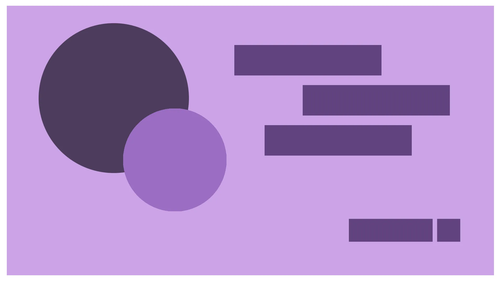
Asymmetrical layout is a dynamic and visually engaging approach to web design that breaks away from traditional balanced and symmetrical arrangements. In this layout style, elements are intentionally positioned off-center or in an irregular manner to create a sense of movement, uniqueness, and visual interest. Asymmetrical layouts challenge conventional design principles, allowing designers to create captivating and memorable web experiences.
Examples of Where to Apply Asymmetrical Layout:
-
Portfolio Websites: Asymmetrical layouts can be particularly effective for showcasing creative portfolios. By positioning images, text, and other elements asymmetrically, designers can draw attention to specific works or highlight the artist’s unique style. This approach adds an element of surprise and creativity, making the portfolio stand out and leave a lasting impression.
-
Fashion and Lifestyle Blogs: Asymmetrical layouts are popular in fashion and lifestyle blogs as they enable a visually engaging presentation of content. By placing images, text, and other media elements in an asymmetric arrangement, bloggers can create a sense of dynamism and visual interest. This style allows for more creative storytelling and enhances the overall aesthetic appeal of the blog.
-
Innovative Brand Websites: Brands that want to convey a sense of innovation and creativity often opt for asymmetrical layouts on their websites. By breaking away from traditional designs, brands can express their unique identity and stand out from competitors. Asymmetrical layouts provide an opportunity for brands to showcase their products or services in an unconventional and eye-catching way.
-
Artistic and Experimental Websites: Asymmetrical layouts are perfect for websites that aim to push boundaries and experiment with design. Artists, photographers, and creative professionals can use asymmetry to create visually stunning and thought-provoking compositions. This style allows for unconventional positioning of elements, encouraging users to explore and engage with the website on a deeper level.
-
Landing Pages and Call-to-Action Sections: Asymmetrical layouts can be utilized to create impactful landing pages or call-to-action sections. By strategically placing key elements asymmetrically, designers can draw attention to important messages or actions. This technique can help increase user engagement and conversion rates by directing the user’s focus to specific areas of the page.
Examples of Asymmetrical Layout
In each of these examples, asymmetrical layouts add an element of visual intrigue, uniqueness, and creativity. Designers can leverage this style to break free from conventional design norms and create captivating web experiences that leave a lasting impression on visitors.